Our logo.

A strong and confident wordmark to support the softer, organic brand language.

The wordmark has been crafted to display an ownable and unique rounded cut to the ‘I’ characters, indicating a subtle link to the brand expression. There are three logo variations within our brand, providing enough flexibility to be used across different contexts and a variety of medias.

One

This is our primary logo. It should be used in all cases, unless the space is too tight or IWMI has already been introduced in the context (see logo three usage).

Two

This is our alternative logo and should be used when there isn’t enough space for our primary logo, for example if the format is long or tight.

Three

This is a logo variation without our full name description. It should be used when IWMI has already been introduced using the primary logo, or the context is clearly IWMI (for example, if the audience already knows us and is familiar with our brand and name), or if the full description is near the logo.
This is our primary logo. It should be used in all cases, unless the space is too tight or IWMI has already been introduced in the context (see logo three usage).
This is our alternative logo and should be used when there isn’t enough space for our primary logo, for example if the format is long or tight.
This is a logo variation without our full name description. It should be used when IWMI has already been introduced using the primary logo, or the context is clearly IWMI (for example, if the audience already knows us and is familiar with our brand and name), or if the full description is near the logo.
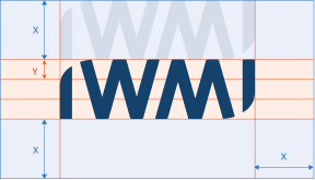
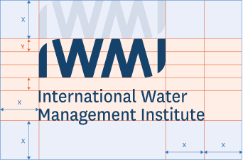
In all instances, a clear space area should be given around our logo, value x. The x value can be calculated by measuring one proportional ‘IWMI’ height from the logo (see ‘x’ below).

x = clear space

x = clear space

x = clear space

All variations of our logo are available in white and dark blue and should not be changed to any other colour, including another one of our brand colours. For instances such as black and white printing, the logo may be printed in black only.

Mono

To retain legibility and readability, our logo should not be used at sizes smaller than those stated below.

One

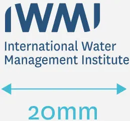
The stacked logo should never fall below the minimum print size of 20mm in width.

Two

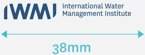
The landscape logo should never fall below the minimum print size of 38mm in width.

Three

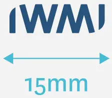
The landscape logo should never fall below the minimum print size of 15mm in width.
The stacked logo should never fall below the minimum print size of 20mm in width.
The landscape logo should never fall below the minimum print size of 38mm in width.
The landscape logo should never fall below the minimum print size of 15mm in width.

All variations of our IWMI logo can be downloaded here, please adhere the above guidelines and if you have any queries, please contact the brand team iwmi-comms@cgiar.org