
Using our chosen fonts consistently will give us a stronger identity and make our brand more memorable. It’s an important part of speaking with a united voice.
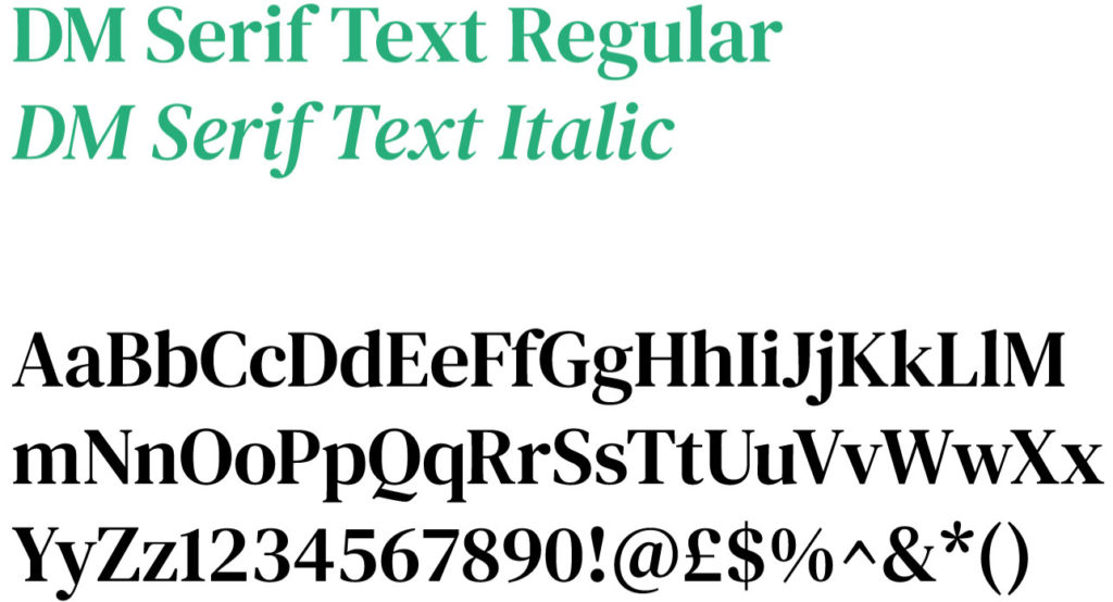
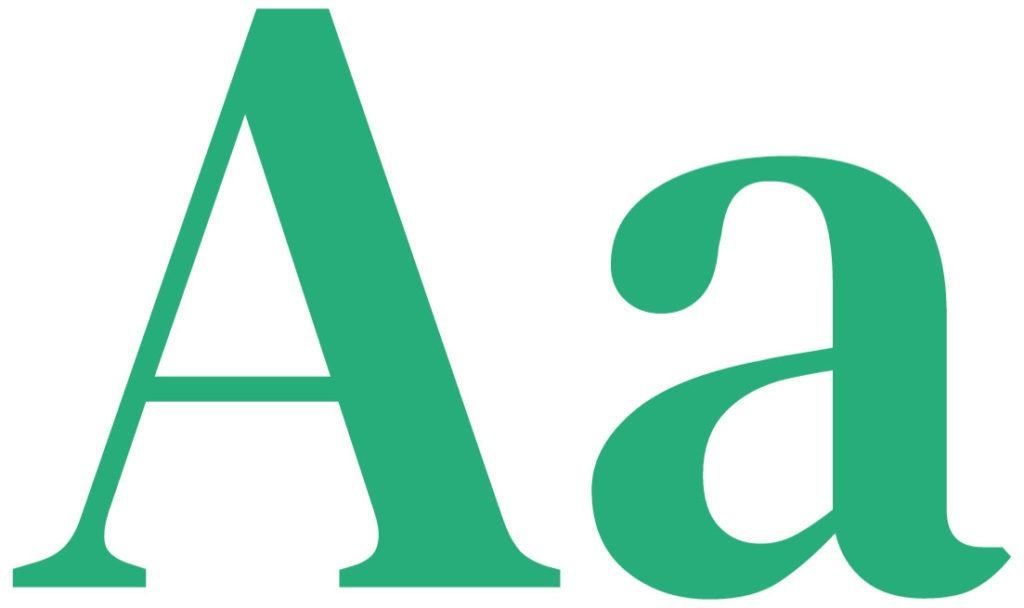
DM Serif Text Regular and Italic are both Google Fonts and are used in the IWMI brand primarily as a heading and display font for both print and digital uses.


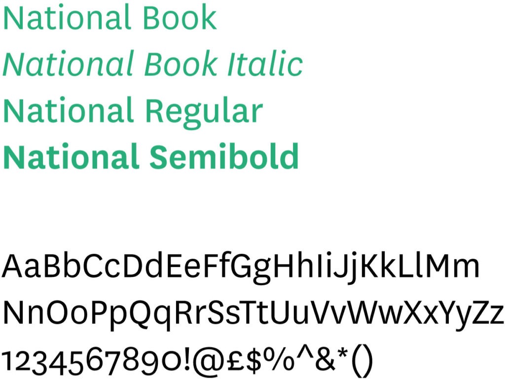
Working in contrast and support of our display font DM Serif Text, our body text font is National Book, Book Italic, Regular and SemiBold. Ensuring that all copy is clear and legible.
Primarily used as main body copy, it can also be used to support illustrations, smaller subheadings, caption text, etc. For ‘Academia and Technical’ documents, it is also suitable for use on larger headings.
The National typeface is a commercial font, please contact iwmi-communications@cgiar.org for more information on its usage terms.
In order to maintain a certain level of consistency across our brand, both typefaces are used interchangeably on all documents and mediums. However the usage can flex dependent on the audience and the function or purpose of the final product. The scale below outlines which typeface should be the dominant and which supporting. For a more comprehensive guide, please refer to our publication guidelines.
Academia
Technical
End user
Functional / Smart
Emotional / Accessible

![]() Scroll to view
Scroll to view ![]()
